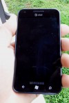
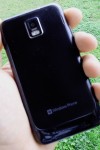
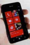
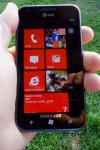
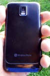
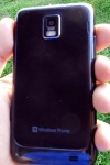
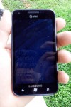
 The Samsung Focus S is the second of two devices that Sammy has released in the WP7 market which succeeds the original Samsung Focus – the other device being the more wallet-friendly Samsung Focus Flash. The Focus S could be considered the real successor to the original model as it has a variety of features which were upgraded from the original Focus. In as much as the Focus resembled the Samsung Galaxy S, the Focus S also resembles the Samsung Galaxy S II. If you are deciding between the lower cost Focus Flash, which also packs in the same CPU and RAM, and the Focus S, have a look at the rest of the review to find out if it’s worth the extra cash to drop on this upgraded device.
[tab name = “About”]
OPERATING SYSTEM
- Microsoft Windows Phone 7.5 Mango
WIRELESS RADIOS
- GSM (2G) Bands – 850/900/1800/1900
- HSPA+ (3G/4G) Bands – 850/1900/2100 – HSDPA 21 Mbps; HSUPA 5.76 Mbps
- WLAN Wi-Fi 802.11 a/b/g/n
- Bluetooth v3.0 with A2DP, EDR
HARDWARE SPECS
- 1.4 GHz Scorpion single core CPU
- 512MB RAM
- 16GB/32GB internal storage
- Primary camera 8 MP, autofocus, LED flash, 720p video
- Secondary camera 1.3 MP
CHASSIS SPECS
- Dimensions – 126 x 66.8 x 8.5 mm
- Weight – 110.6 g
- Super AMOLED Plus capacitive touchscreen, 16M colors
- 480 x 800 pixels, 4.3 inches (~217 ppi pixel density)
MISC SPECS
- Accelerometer
- Proximity Sensor
- Ambient Light Sensor
- Compass
- Stereo FM radio with RDS
- GPS with A-GPS support
- SAR US 0.33 W/kg (head) 1.12 W/kg (body)
BATTERY SPECS
- Li-Ion 1650 mAh
- Stand-by Up to 250 h
- Talk time Up to 6 h 30 min
[/tab]
[tab name = “Our Take”]
Design
The hardware design is downright gorgeous. This is a very thin and lightweight device at only 126mm x 66.8mm x 8.5mm, weighing a mere 111g (3.9oz.), with a glossy edge and plastic backing. The glossy side accents the device very nicely. It gives a distinctly “Samsung” look to the Focus S. The back battery cover is plastic, but that doesn’t take anything away from the solid feel of the device. The plastic back actually makes it easier for me to grip. It also makes the device much less prone to scratching.
The front is just as nice looking with its piano black finish. The front also holds the front camera, proximity and ambient light sensors, LED, headset speaker, and a brilliant 4.3″ Super AMOLED Plus display at WVGA resolution (480×800 pixels). The display shows off its truly radiant appeal indoors or out. The viewing angles are spectacular; the brightness leaves naught to be desired; details appeared without any distortion or wash on screen. The only issue that many reviewers, including myself, have noticed was that whites on screen have a very slight bluish tint. It isn’t very noticeable, but it was enough to catch my attention in the Mail Hub, with its white background.
The buttons on the device feature the standard fare of power, volume, and camera. The power button is in the standard Samsung placement of opposite the volume rocker. For me this makes pressing the button to be a chore and is the only design aspect that I did not like. The typical way that I hold my phones causes me to press down the volume buttons as well as the power button every time, no matter which button I was aiming for. It would be nice to see the power button return to the all-too-familiar top area of the device. The camera button is two-stage. Pressing it halfway focuses the shot, while depressing it fully will snap the picture. As in any WP7 handset, holding down the camera button from the sleep state for three seconds will bypass the lockscreen and turn on the camera straight away. Some dislike this feature, but I welcome it. It makes snapping pictures a breeze when the device is tucked away in my pocket. The only notable thing is that the buttons on this device all stick out somewhat farther than most smartphones. This wasn’t a problem for any of them but the camera button. I often found the camera was activated already when I pulled it from my pocket. Below the screen are your standard set of capacitive WP7 buttons for back, start, and search.
Performance
Windows Phone devices all sport single core processors in a growing field of dual core smartphone CPUs. Android fans tend to look down on this, but once you use the OS, you realize how unnecessary a beefier processor is on such a simple and light OS. Apps load much faster in general on the Focus S with its 1.4GHz single core than on the SGS2. Even with the dual core 1.5GHz Scorpion chipset of the SGS2, I noticed a more responsive and snappier interface while using WP7. The point is that you don’t need monster specs to make a top notch device. You just need an efficient operating system which makes good use of the hardware that it is presented. WP7 does this with ease.
Calling and data use was about what one would expect on AT&T’s network – average at best. My calls ranged from sounding like I was on any other cell phone to sounding like a robot. It is of note that I never had trouble hearing the other party, and calls always sounded crisp coming from them. The headset speaker is perhaps not loud enough for my taste, as even though the incoming audio was clear, it sounded distant. Data on AT&T is always a hit or miss thing. The Focus S sports a 4G radio on AT&T’s HSPA network, but does not feel like it most of the time. While there isn’t an official FCC-approved speed test app for WP7 yet, like Ookla Speedtest, I did manage to top out my speeds at an average of 2.5Mbps down and 0.9Mbps up. My aging T-Mobile HTC HD2 gets nearly three times better speeds than that on 3G. Those speeds varied quite a bit, so take my numbers with a grain of salt. It was mostly sufficient for watching YouTube videos and general browsing, but I did not have any good experience when trying to video chat using Tango. The image was so grainy on both ends that I could barely make out who I was talking to. All of this improved when using the features over Wi-Fi. Overall, I can’t really fault the Focus S for AT&T’s shaky network.
Camera
Camera quality is always a difficult thing to judge on smartphones. We always want to believe that adding more megapixels will garner a better experience. This isn’t always the case, especially when dealing with super thin devices. While the Focus S has a nice camera, it still isn’t something that would make me want to abandon my stand alone camera for important events, where I know I would be taking pictures anyway. The device features an eight megapixel autofocus camera with an especially bright LED flash. The camera takes decent still images with vibrant, but often times exaggerated colors. In very bright light, the colors were often brighter than the subject, making the images somewhat unclear. It is a step up from the original Focus, to be sure, but still leaves something to be desired. Most indoor shots proved to be just about average for most of this generation’s smartphones. Colors were mostly consistent, and the focus was nearly always spot on. It helps to have that two-stage camera button to focus the picture.
The video quality wasn’t anything I would be proud of. I suppose it is something that simply comes out of the trade off of feature vs. form factor. The Focus S shoots video at 1280x720pixels, but doesn’t do HD any justice. The camera lacks any continuous autofocus, zoom controls, or noise reduction. I found that several times the video became noticeably washed out or grainy. Trying to record on a cloudy day yielded very dark and unfocused video as well.
Software
The Samsung Focus S ships with Windows Phone 7.5 Mango. There are things about the operating system that I like and dislike equally. First, I can’t give Microsoft high enough marks for their integration in the People Hub. It easily and seamlessly integrates all of your contacts and their social circles into one easy to navigate Hub. In Mango, you have access to not only Facebook, but also Twitter and LinkedIn. While chatting with contacts, you are easily able to swap between SMS, Windows Live, and Facebook chatting. The trick they’ve implemented is that your conversations are all grouped according to the contact, not the chat service. You are easily able to move between SMS or Facebook chatting or even Windows Live without missing a beat.
I have to admit that the People Hub is where my fascination for Windows Phone 7 ends. The experience is the same bland thing across any device you come in contact with. There isn’t any way to make your device stand out or pop other than to change the color of the tiles on the home screen. I’m not advocating another OS over WP7, but Microsoft really needs to step up their game if they want to be able to really compete in this market. Even the predecessor of Windows Phone 7, Windows Mobile, allowed its users to make their devices shine. Different looks help to drive the device and make it something really personal.
The thing I really can hand to Microsoft is the simplicity of the user interface. They may not have been going for this, but Windows Phone is a great way to introduce someone who isn’t familiar with smartphones into the fray. It is simple to use, and doesn’t require lots of time to fool around with. Simply put, it just works.
[/tab]
[tab name = “Install or Not”]
Overall
My thoughts on the Samsung Focus S are mixed. It is a great looking device with excellent hardware. The design is aesthetically pleasing, the form factor comfortable, and the user experience consistent. I would go as far to say that the Focus S is easily the most enticing Windows Phone on the market at the moment. It is overall enjoyable even though it suffers from the growing pains associated with Windows Phone. The bottom line is on what you expect to get out of it. If you are a power user with your thoughts set on customizing and tweaking the device to no end, wanting access to custom mods, jailbreaking, or even an impressively large app store, then iOS or Android might be a better suit for you. However, if you are looking to integrate your device into your already large bevy of Microsoft Office products, or you are new to the smartphone game, with little interest in anything other than being in and out of your phone as fast as possible, then this would be the perfect match for you, as Microsoft certainly made it easy to get your notifications and move on with life as usual.
[/tab]
[tab name = “Gallery”]
[/tab]
[easyreview title=”Install or Not Scorecard” cat1title=”Design” cat1detail=”” cat1rating=”4″ cat2title=”Ease of Use” cat2detail=”” cat2rating=”4″ cat3title=”Performance” cat3detail=”” cat3rating=”4.5″ summary=””]

