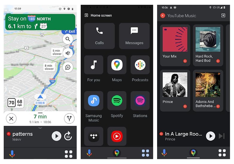
It has been confirmed that Google is testing its dedicated card mode, which is known to replace their existing car navigation UI. The new card mode is still in testing mode but is believed to be seen soon with the latest updates. However, some of the features have been seen for the latest car mode, and we know how it would look like and why it will be replacing the car navigation UI.
Interface Changes In Dedicated Car Mode
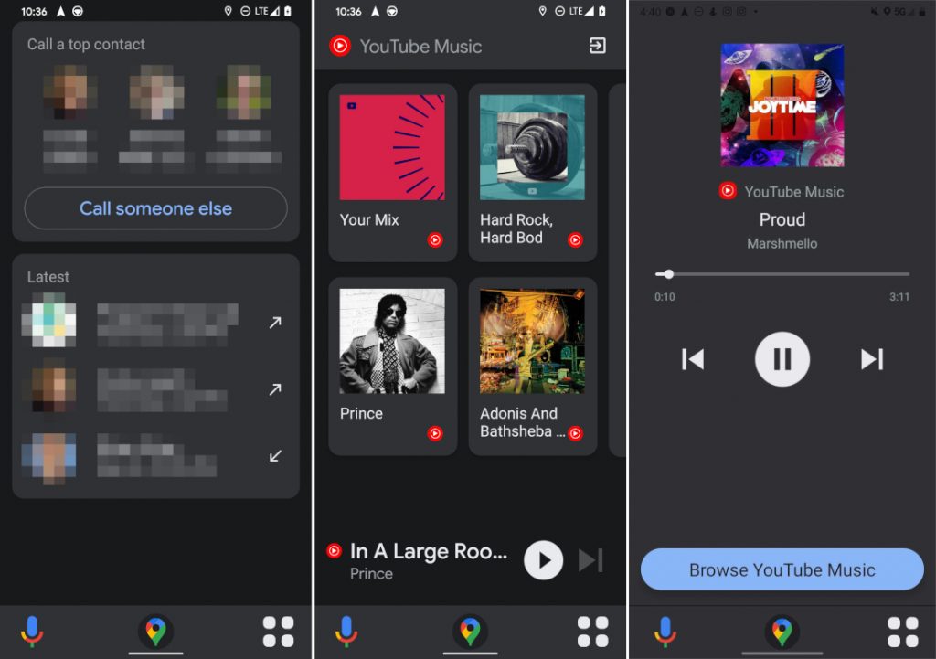
There are no major changes on the main map screen in the new dedicated car mode, but for sure, we will see some changes to the bottom of the screen. The new car mode will be adapting some interface resemblance from Android Auto’s current map. The new bottom app bar will have two buttons, the left one to activate Google assistant, whereas the right button will be up to the app menu. The app menu will have some of the essential apps that you can easily access while using Google maps such as calls, messages, YT music, etc.

The App Screen
The app will have their respective app screen, i.e., when you click on any of the apps, they will open up on their dedicated app screen. As the app opens, there will also be an option to switch back to the main map screen. The option to switch back will appear at the center of the bottom app bar.
Conclusion
The new driving mode of Google Maps was announced a year back. And since then, there’s no new update about the development. It can be concluded that the mode is still under development and won’t be made available to the public till its bug-free. With its release, it will also be replacing the Android auto’s UI. Upon its completion, it is sure to be made available to the public and replace Android Auto’s UI.


