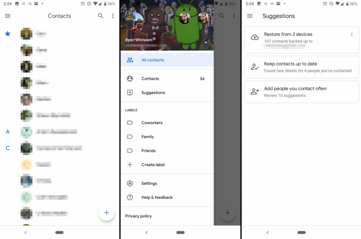
 Google has introduced its all-new redesigned Contacts app for Android Users. The best part with the new design is it contains an all-white Material interface. The new Contacts v3.0 is all new redesigned Google contacts app with an all-white Material interface.
Although you may find all the features like menu options and settings similar to the older version. But the newness is brought to you with the adoption of Google’s new Material Design style. In the redesigned Google v3.0, they have replaced the Blue top bar with the White one. Also, the transitions take place smoothly and one can not notice when they jumped to the scrollable contact list.
You’ll also find the navigation bar and the icons have also adopted the new wireframe material style. These are the few changes we saw on the new Contact v3.0. If you look deep, you’ll find that the design itself is of Material v2.0 but Google still calls it the same Material design despite the changes.
With the launch of Android 9.0 Pie, we can see tons of new features in the base UI. Google will slowly roll out the new version of Google Contacts in the Play Store. But if you want to try it now you can download it from the link given below.
Contacts v3.0 – Download
Source – Android Police

