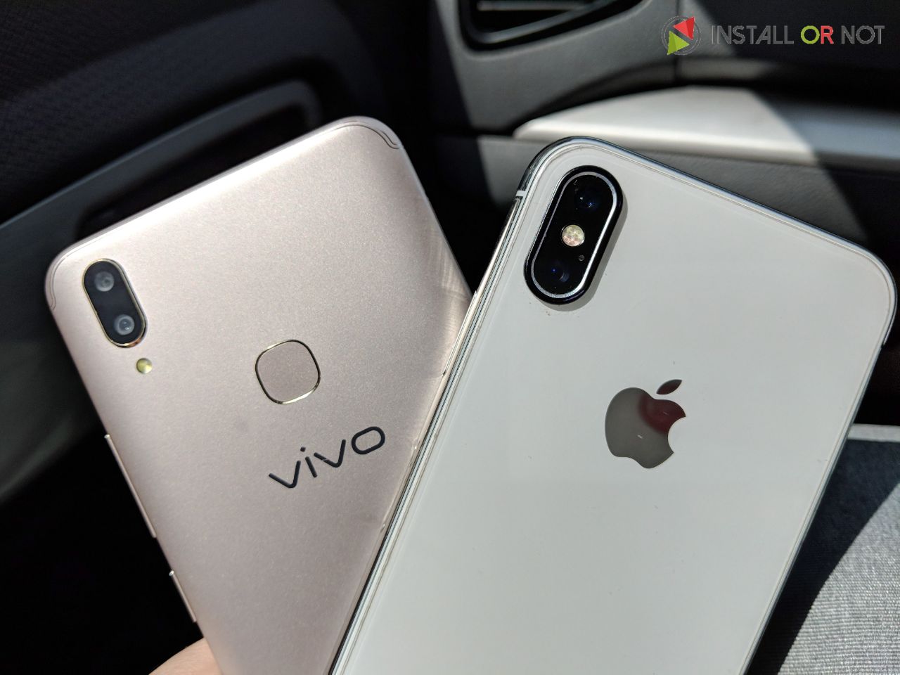
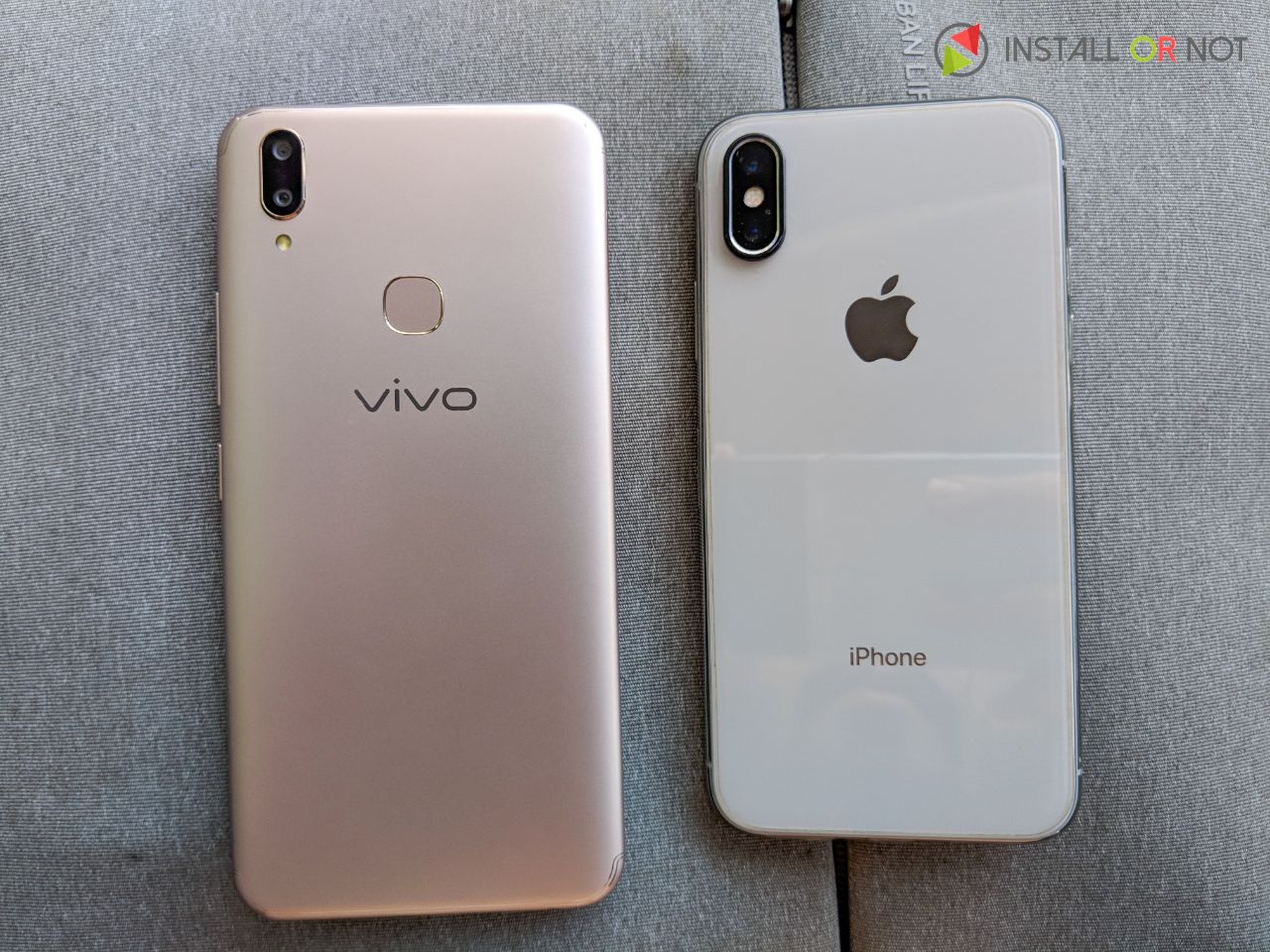
Let’s just address the elephant in the room, the Vivo V9 has a design that is very obviously inspired by the iPhone X. The bezel-less display at the front with a notch at the top, the alignment of dual camera module at the back, user interface (FunTouch OS) and gestures totally inspired by the Kanye West of smartphones, the iPhone X.
The Mighty Notch
The notch on Vivo V9 just sits at the top and houses a 24-megapixel selfie camera, earpiece, notification LED, and other sensors. The display on Vivo V9 is tall, and yet fits in a 5.5-inch-like form factor. Vivo has managed to cram in a 6.3-inch display with a 19:9 aspect ratio and a resolution of 1080×2280 pixels. The “ears” on either side of the notch are used to show system status icons.
And let’s just accept it, every big Android release this year will likely have that same notch. And it is unlikely that the notch is going away anytime sooner. I personally was never fond of the notch and when I saw the graphics renders, I totally hated it. The notch on the iPhone X is quite wide and it definitely hinders the viewing experience, but the notch on Vivo V9 is perfectly balanced and you won’t even notice it after a few hours of use. Let’s just put it this way, I’m using the iPhone X for about 3 months now and I still can’t get over the notch and I notice it every day but in case of Vivo V9 the notch does not hinder the viewing experience as the notch is not as wise as found on the iPhone X.
Honestly, the notch doesn’t really get in my way unless I’m watching fullscreen videos, which makes up maybe less than 10% of my phone usage.
The Doppelganger Brothers
At first glance, or I can say at every glance the VIVO V9 shares a lot of its design constraints from the iPhone X. Well, it’s not the exact replica of the iPhone X, it’s just the notch cutout at the front and the alignment of the rear camera module. Besides that, the device inherits a lot of its design from its predecessor, the Vivo V7 being touted as the iPhone X clone is a much-refined package. The device feels subtle to hold and reminds me of how tiny and cluttered the display of iPhone X is and I wish what if my iPhone X is of same dimensions as of Vivo V9.
The X-Camera
With a DXOMark score of 87, the iPhone X tries to justify the price range of INR 89000 or roughly $1400, but with a week spent with Vivo V9 and taking it down the streets of New Delhi and Mumbai, I can surely say that the dual camera setup on the V9 is no joke. The colors are accurate, dynamic range is slightly above average, and the camera focuses relatively fast. Of course, the camera of the V9 cannot be compared with the likes of Samsung Galaxy S9, Pixel 2 or other top end flagship device and it would not be fair to compare it with these flagship devices. But considering the price of INR 22990 the Vivo V9 captures some great looking shots.
The highlight feature of the device is its 24MP front-facing camera with f/2.0 aperture which when compared to the iPhone X ‘s 7MP camera looks better on paper. And it turns out the selfies from the Vivo V9 are no less than the iPhone X. The company claimed that the device uses artificial intelligence to automatically detect the gender, age, skin tone, texture and the lighting condition of the environment to automatically adjust the settings of the camera which makes the selfies on the Vivo V9 turn out to be better as compared to the X.
FunTouch iOS OS 4.0
The Vivo V9 sports FunTouch OS, which is almost a replica of Apple’s iOS but not entirely. Vivo’s Android skin, dubbed as FunTouch OS is heavily inspired by iOS. First things first, there is no app drawer just like the iOS and all apps are placed at the home. The new Funtouch OS 4.0 includes a ‘Memories’ feature that comes built into the Gallery app which just like Google Photos searches photos by text and the system will use image recognition to tag photos automatically. There’s also a ‘Game Mode’ to stop notifications while you are gaming, a full screen ‘Navigation gestures 2.0’ to mimic the gesture-based system from iPhone X, a ‘Global search’ across the system and ‘EasyShare’s 5G ultra-fast transmission’.
I personally really liked the gesture navigation buttons that replace the traditional three button Android set-up. And No not this time, Vivo hasn’t inherited this from Apple, as this similar feature was introduced in Vivo V7 last year. All of these swiping around work great though and makes navigation on the V9 feel more futuristic and I fell this should be the way all Android phones should implement navigation buttons and even if Apple could implement this to the new iPhone next year. Just Saying!
Cheap at Twice the Price
The Vivo V9 is available at INR 22990 and the iPhone X is available at INR 89000 which is almost 4 times the price of V9, and no doubt iPhone X is a better device in terms of everything be is Hardware, software, but is surely not a value for money device. The X is meant for Apple enthusiasts and die-hard Apple fanboys, and the price at which iPhone X is retailing in India is definitely out of reach for most of the consumers looking for a great value for money device. While on the other hand, Vivo V9 has almost all design constraints inherited from the X, with visually similar looking software as the X but with some added features such as gesture support, AI, face recognition features and goodness of Android 8.1.0 over it. The V9 if not better has a premium build quality and a nicer camera than comparable similar devices belonging to same price bracket. So if you were really astonished by the iPhone X and you really craved for that device even once but you didn’t want to have a big hole in your pocket then in our opinion the Vivo V9 comes closest to being an iPhone X with its own identity intact and at one fourth the price of X.
Disclaimer: This is a sponsored post.






I think the price is spot on… in fact I think its perfectly priced
I think Vivo V9 is a cheap price , compare to IphoneX has a high value phone with notch, So Vivo V9 is for me, Very fast and Very Elegant phone compare to IphoneX I can’t afford
Vivo V9 is very cheap,
iPhone X is better than Vivo V9
Great Article sir Phone looks good The best thing is the Front camera it is the best feature but the other specs are not that good they should have used Snapdragon 636 instead of 626 and i hate the notch they should have priced this phone under 15k than it will be a great phone at 23k there are way better options than this phone
I think it is correctly priced
VIVOV9 pricing is little bit high should be around 18k
I think that #VivoV9 is better than #iPhoneX because there is huge price difference
Vivo v9 has big display and it is too cheap than iPhonex
It has also notch
Also a 24 mp selfie camera for capturing clearer selfies
I like the specs. Price 23K is ok
Pricing is ok regarding the specs ?
Such an amazing featured phone in affordable price would be like dream itself. And who doesn’t likes to fulfil his/her dream.
SD 626 for 23K is not good. Price should be 20K
I also think the same, Vivo V9 is a great combination of cameras, performance, software and design and due to that huge price difference it’s definitely the best alternative to iPhoneX!!
Price is Okay I think , Considering the Better display , a Good Chipset , Cameras & More importantly Vivo’s track record ?
Not value for money. Too much price
Really this article focused on Vivo V9 and it’s qualities. What we got in very lesser price than others cistlc smartphones. Vivo v9 gives us a ravishing and empowered look.
VIVO V9 is the better Smartphone than iPhone X & it’s much much cheaper
VIVO V9 price is good but not very good.
Great smartphone from vivo. Good dual and selfie camera and processor Overall is a good budget smartphone in good price
X is a premium device Vivo V9 is more of a practical device. When compared to X… V9 has more friendly usage. When it comes to price definetly V9 beats the X.
I think VIVO V9 is the best iPhone alternative . but price is little bit high.
It will good around 20k.
The phone is looking very nice with decent specs and design and pricing should be about 20k
One of the best smartphone from Vivo. Price is also good
Pricing is really Good compare to specs, though It would have been even better if they included metal body, with Fast charging support. Thanks for the Article.
I think this phone is good where you can see all features in your hand its cool to see this phone but price is very high as compared to india vivo postion in india
This is first vivo smartphone I liked and great price
Vivo is always a good & cheapest phone. I am experiencing with it for nearly 3 years. I think Vivo V9 is coming in reasonable price around 23K.
Pricing is okay, when we consider the specifications of the phone
I think the phone is awesome, ueah agreed inspired alot from iPhone X and like you, I’m not a fan of NOTCH BUT we have to accept it that its not going anywhere soon. But other things/features like camera , looks and I think its the cheapest phone on market giving NOTCH.
Honestly sir/mam.. Vivo is a very good and innovative company of smartphones.vivo v9 is good and also having some twerks or pros to give competition to others but if every smartphone company is copying apple look then its very bad for us to buy such smartphone. So my opinion is that if you dont have anything new for your smartfones looks then dont copy any other company look.for eg. Now every company whether it is small or big giving dual cameras on rear and apple also but still google pixel is having only single camera and its the world best smartfone camera right now.so why pixel or google dont give dual camera because it just a marketing gimic. So my opinion about vivo v9 is just make something new to attract customers not just copy others look or design..
I think that #VivoV9 price is on higher side,should be under 18000
Vivo v9 the phone is looking pretty gud but the price is more it should be around 17k to 18k
But overall phone is gud
Pricing is high they should have priced it under 15k than it will be a great phone.
It’s a bit Overpriced phone I think Considering its Chipset (sd626) , if it had sd636 it would have been a great package because it has gorgeous display , 18k-19k price would have been great
I think this phone is overpriced they should have priced it under 15k because there are way better options than this phone like Redmi note 5 pro, Honor 7x etc.. This phone is only good for selfie lovers this is only the main selling point pf this phone and the specs are also not that good they should have used Snapdragon 660 instead of 626 at this price of 23k this phone is only good for offline buyers.
Vivo V9 is the first Android smartphone with a notch to launch in India.
Performance is decent, and the UI is packed with features.
The Vivo V9 is making headlines thanks to its thin screen bezel and the notch that sits right at the top. While the device looks pretty interesting.
Who don’t want this vivo v9 ?
I wish to win it, Thanks for this opportunity team ! ?
It’s an awesome phone ❤❤❤❤
Yes, It’s a masterpiece Phone… A Good alternative of iPhone X
One of the best smartphone from Vivo
Nice phone i like this phone and its features also but the price not as good as it becacuse as we see the vivo moblie in india has not so good postion but vivo will get a better condition in next few years as i think i like this phone looks and its camera like iphone
Very nice
Price of Vivo V9 seems okay when looked in Comparison to Iphone X , But when compared to android phones in this Price range , I can see some compromises , Like Micro usb port , back panel is plastic , Chipset slightly old , Single camera on the back !
With the V9, Vivo has managed to ship the first Android phone with a notch in India – for whatever that’s worth. It has decent hardware, and the software has lots of customisations. The display helps it stand out from the rest, and those wanting to show off a phone with a notch now have this option at a price that’s certainly a lot more affordable than the iPhone X.
The pricing is affordable.
[…] has been a lot of talk about Vivo V9 being similar to the iPhone X and yeah we agree it looks similar but the device has many features […]
Thanks For Telling Me About This as I was Confused Between both the phones, which should i buy! but now i knew it which one should i buy !!