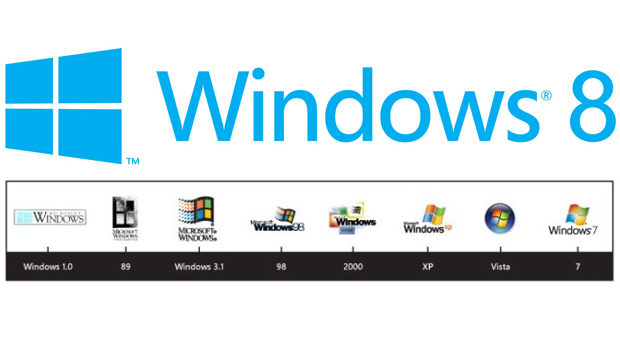
With Windows 8 set to launch pretty soon, reinventing the Windows experience, Microsoft though it’d be nice to redesign the logo.
The new logo, which has a striking resemblance to the Finnish flag, looks more like a window, thus Windows, than a flag, like the majority of their previous logos. The new logo is one colour only, Blue, and skewed, a bit. It looks a lot like the new Metro UI and should be much easier to recognise while still being modern.


